Restaurant Branding on a Budget: Look Professional Without an Agency
You don't need a design agency or a big budget to look like a real brand. A practical guide to building a consistent, professional restaurant identity — logo, colours, fonts, and voice — that makes small places feel established.
Restaurant Branding on a Budget: Look Professional Without an Agency
Two cafés open on the same street in the same month. One looks pulled-together from the first day — a clean logo on the window, a colour that shows up on the cups, the menu, and the Instagram grid, a name you remember. The other has a great flat white but a printed-at-home sign, a menu in a different font every week, and a logo that looks nothing like its social media. Guess which one people assume is the bigger, more trustworthy business. Guess which one they photograph and post.
Here’s the thing: the polished one didn’t necessarily spend more money. It spent more thought. Branding isn’t an expensive luxury for chains — it’s mostly about consistency, and consistency is free. This is a practical guide to looking like a real, established brand without an agency or a big budget.
What branding actually is (and isn’t)
Let’s clear up the biggest myth first. Branding is not your logo. Your logo is one small piece of it.
Your brand is the overall feeling people get from your restaurant — the promise they sense before they’ve even ordered. It’s the sum of your name, your colours, your fonts, the words you use, the vibe of your space, and yes, your logo — all working together to say one clear thing about who you are. A rustic sourdough bakery, a slick specialty coffee bar, and a family shawarma spot should each feel completely different, and every touchpoint should reinforce that feeling.
The goal isn’t to be fancy. It’s to be consistent and clear. When your sign, your menu, your cups, your receipts, and your Instagram all obviously belong to the same place, people’s brains read it as “this business has its act together” — and trust follows.
The four building blocks
You can nail the essentials with four simple decisions. Make them once, write them down, and stick to them everywhere.
- Colours: pick two or three, and commit. One main colour that’s yours, one neutral (a warm cream, a charcoal, a soft grey), and maybe one accent. That’s it. Use them everywhere — the same green on your sign, your menu header, your cups, your website. Resist adding a new colour every time; discipline is what makes it look designed. Free tools like Coolors will generate a tasteful palette in seconds.
- Fonts: choose two and never wander. One characterful font for your name and headings, one clean, easy-to-read font for everything else (menu items, body text). Two fonts, used consistently, look more professional than ten fonts used randomly. Avoid the tired defaults; a well-chosen free Google Font instantly lifts you above the pack.
- A logo you can actually use. It doesn’t need to be a work of art — it needs to be simple, legible when it’s tiny, and to work in one colour. Honestly, a clean wordmark (just your name in a nice font) beats a cluttered illustration every time. Tools like Canva have restaurant logo templates that look genuinely good, and a freelancer on a marketplace can make something custom for a modest fee if you want.
- A voice that sounds like you. How do you talk to guests? Warm and cheeky? Calm and refined? Pick a tone and use it everywhere — your menu descriptions, your signs, your Instagram captions, your reply to a review. A consistent voice is branding most people forget, and it costs nothing.
Consistency is the whole game
Here’s the secret that makes small places look big: use the same everything, everywhere. Same logo, same colours, same fonts, same voice — on every single thing a customer sees.
Where it shows up:
- Your storefront and signage — the first impression.
- Your menu — printed and digital, both matching your identity.
- Your website — the same colours and fonts as everything else.
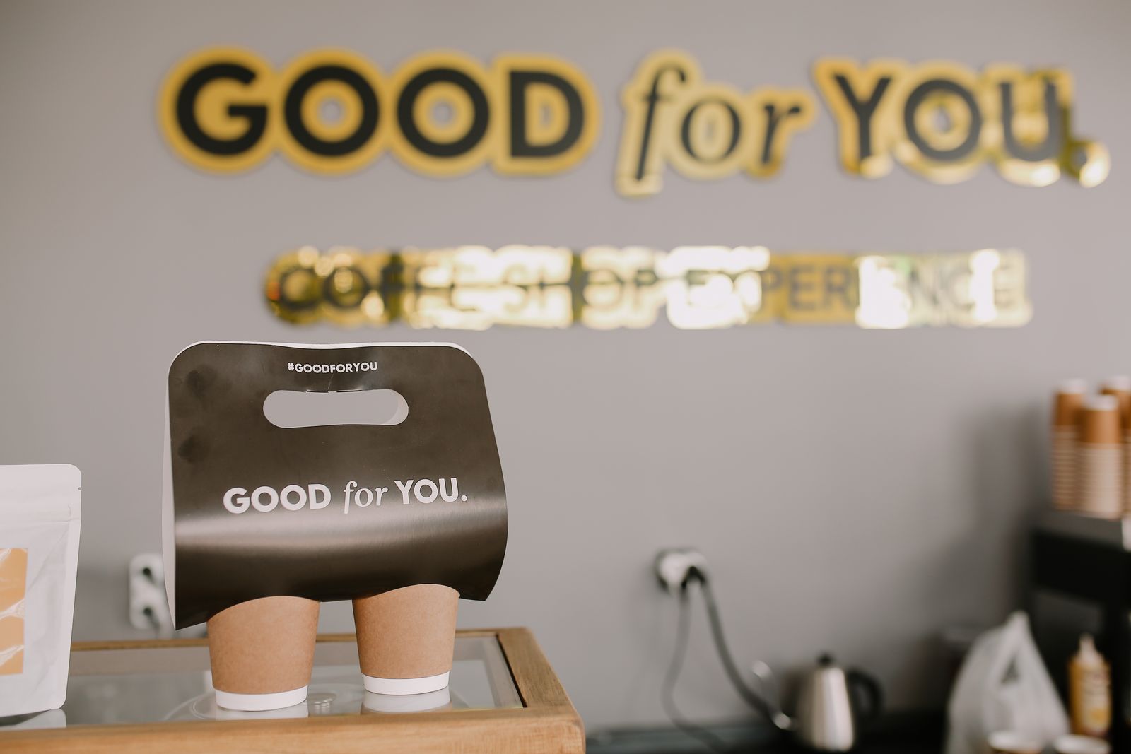
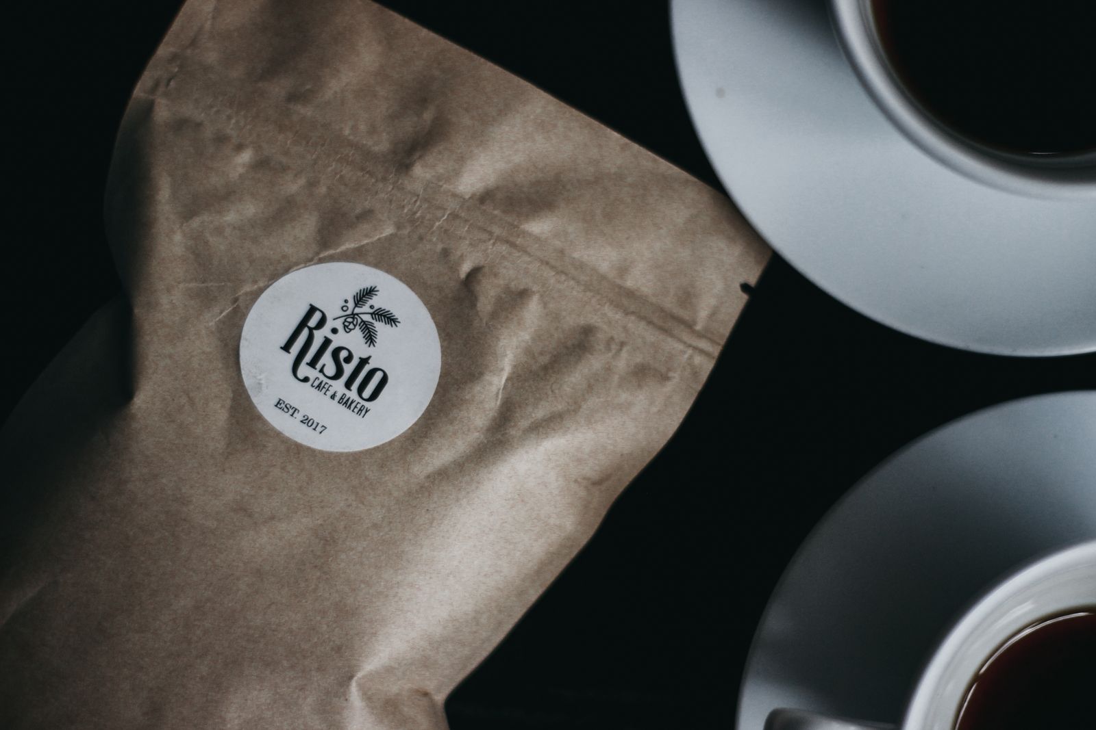
- Your packaging — even a stamp on a plain kraft bag or a branded sticker turns takeaway into a walking advert.
- Your social media — a grid that shares one colour story is instantly recognisable in a busy feed.
- The small stuff — receipts, business cards, the staff apron, the loyalty card.
Every one of these is a chance to reinforce the same feeling. When they all agree, a three-table café can look every bit as established as a chain.
Where the budget really goes: consistency, not cash
Notice what did the heavy lifting above — not money, but a few decisions applied consistently. That’s genuinely where most of the professional look comes from. But two areas are worth a little spend if you have it:
- Photography. Great food photos do more for your brand than almost anything. If you can, invest an afternoon (yours or a cheap freelancer’s) in a proper set of shots. Even phone photos in good light will do — the point is that they look intentional and consistent.
- Your website. This is where more and more first impressions happen, and a mismatched or non-existent site undoes all your other good work. The good news is that this used to be the expensive part and no longer is. A platform like Lekro lets you build a professional restaurant website — carrying your colours, your fonts, your logo, your menu — without a designer or a developer, so your online presence finally matches the care you put into everything else.
The one-page brand sheet
Do this and your branding will hold together for years: write a single page — a note on your phone is fine — that lists your final decisions. Your two or three colour codes, your two font names, where your logo files live, and three words that describe your voice (“warm, honest, playful”).
That’s your brand sheet. Every time you print a menu, post to Instagram, design a sign, or brief someone to make something for you, you check that one page. It’s how a small team stays consistent without a design department — and consistency, as we’ve seen, is the whole trick.
Give your brand a website to match
Lekro lets you build a beautiful restaurant website with your own colours, fonts, and logo — no designer needed. Bring your brand online in an afternoon. Start free.
You’re closer than you think
You don’t need to rebrand overnight or spend a fortune. Pick your colours, pick your fonts, tidy up your logo, and write your one-page brand sheet this week. Then, bit by bit, bring everything else into line — the menu, the cups, the website, the social grid. Within a month or two, without spending much at all, your little place will start to look and feel like a brand people trust, remember, and recommend. That’s the whole return on a bit of consistency.
Tags