
Editing a Section's Content
Open any section to change its text, swap photos from the Photo Library, pick a layout, and tune its look.
Editing a Section’s Content
Stacking sections gives a page its shape; filling them in gives it a voice. Every block on your site has its own little control panel — the words it shows, the photos it carries, the way it’s laid out — and opening it is as simple as a click.
Opening a Section’s Editor
In the Structure tab, click a section’s name in the list and its editor unfolds right underneath. You can also click the section directly in the live preview on the right, which selects it and opens the same editor. Whatever you change appears in the preview as you type, so you’re never guessing.
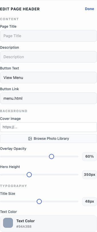
The fields are grouped so related controls sit together, and the exact set depends on the section. A few kinds turn up again and again:
- Text fields for titles, subtitles, and body copy. If your restaurant runs in more than one language, you type each language’s version separately — the editor follows whichever language the preview is showing.
- Layout and style pickers, shown as small visual tiles rather than a dropdown, so you choose by sight. A menu grid, for instance, offers several card styles; pick one and the whole section snaps to that look.
- Alignment, toggles, and sliders for the finer points — whether text sits left or centered, whether an optional element shows, how large or rounded something is.
When you’re done with a section, the Done link at the top of its editor closes it again. Nothing here saves to your live site yet — it’s all part of the draft until you publish.
Swapping Photos with the Photo Library
Any image field has a Browse Photo Library button beneath it. Click it and your media library opens in a window of its own — a home for all the photos you upload to your site.
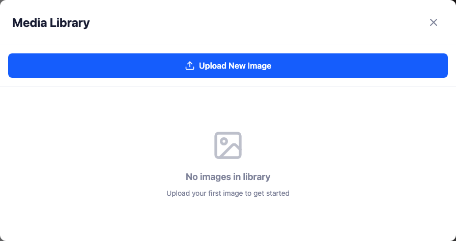
The first time it’s empty; Upload New Image adds your first photo. After that, the same library turns up everywhere you pick an image, so a photo you upload while editing your hero is there later when you’re filling in a gallery. Upload once, reuse anywhere.
A Note on Lists
Some sections — a feature grid, a gallery’s captions, a set of opening hours — hold a list of repeating items rather than a single value. These give you an Add item button to grow the list and a small remove control on each entry. Add as many as the section is built to show; the layout adjusts to fit what you put in.
Once a section reads the way you want, you’re ready to make it public — head to Reviewing & Publishing Your Changes.