
Customizing Your Brand
Use the Design Studio to shape your website's look — theme, colors, fonts, and layout — with a live preview.
Customizing Your Brand
A fine-dining room and a burger counter should never have the same website. Your site’s look is part of how customers size you up before they’ve tasted a thing — so Lekro hands you the controls. Colors, fonts, logo, layout, the shape of the corners: it’s all yours to set, and you can watch every change happen live before anything goes public.
Where It Lives
Everything is in the Design Studio — open Website → Design. The workspace is split in two: a column of controls on the left, and a live preview of your actual site on the right that updates as you tinker.
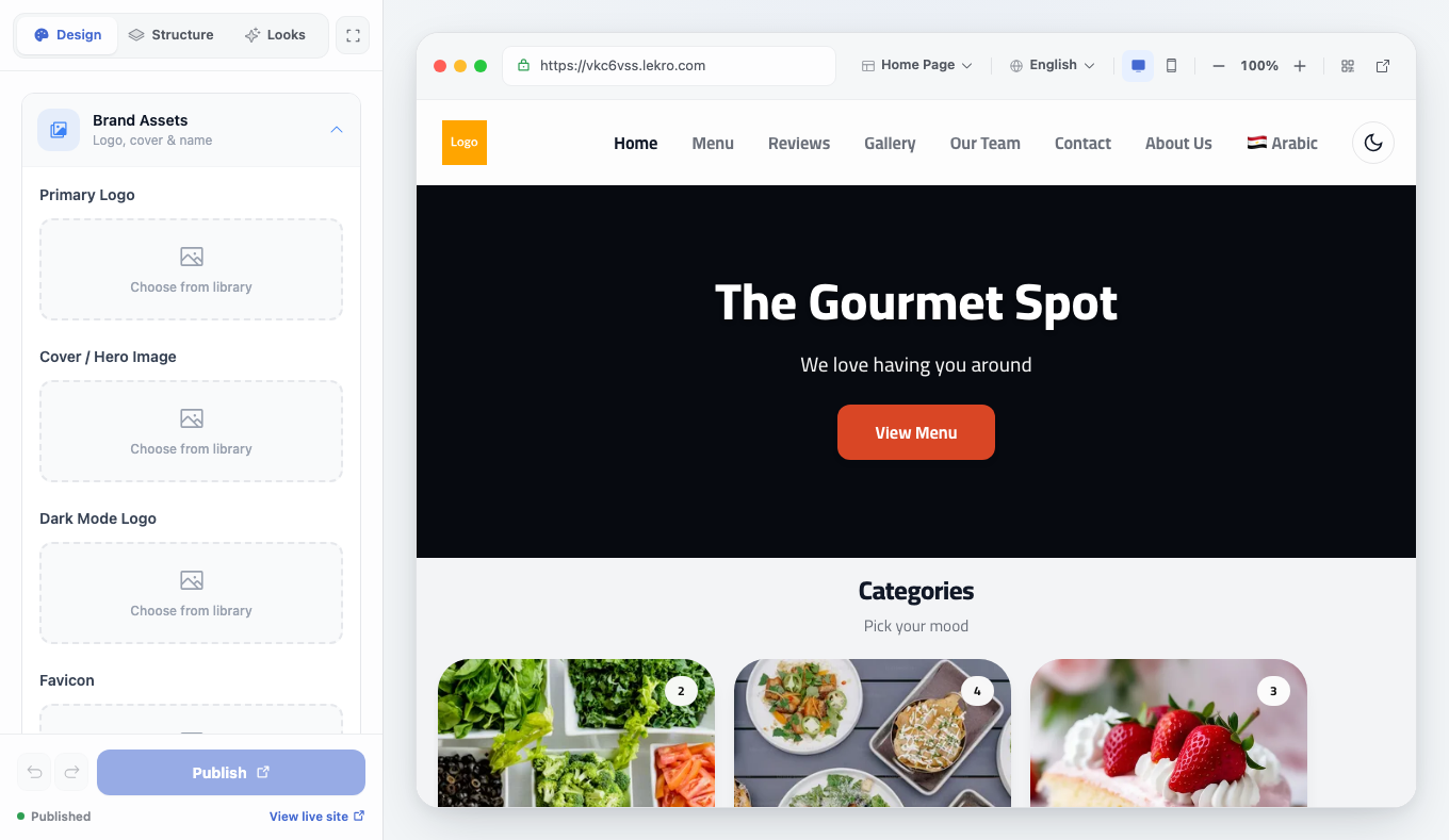
The controls are organized into three tabs:
- Design — your brand details: logo, colors, fonts, and so on.
- Structure — the sections that make up each page and their order.
- Looks — one-click full-site styles and the theme switcher.
Nothing you do here touches your live site until you hit Publish — so feel free to experiment.
Start With a Look
The fastest way to a site you like is to start from a ready-made look rather than a blank slate. Open the Looks tab:
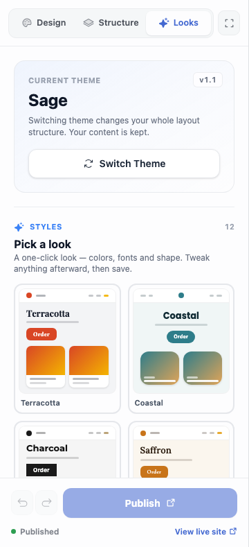
There are two levels here:
- Switch Theme changes the whole skeleton of your site — its layout and structure. Your content stays put; only the frame around it changes.
- Pick a look applies a curated style — a coordinated bundle of colors, fonts, and shape — in a single click. Try a few and watch the preview repaint instantly.
Pick whichever feels closest to your restaurant’s personality. You’ll fine-tune the details next.
Fine-Tuning the Design
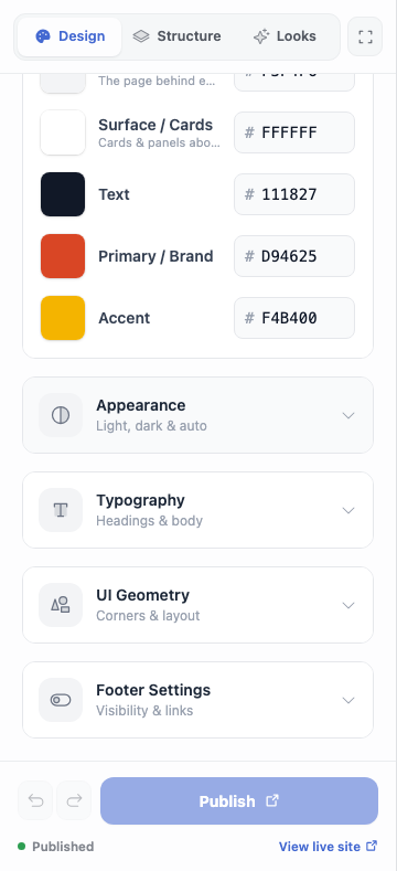
Switch to the Design tab to adjust the specifics. It’s a set of sections you expand one at a time:
- Brand Assets — upload your logo, a cover / hero image for the homepage, a dark-mode logo, and a favicon.
- Header Layout — choose how your header is arranged, like where the logo sits and how the navigation reads.
- Color Palette — set your surface, text, primary / brand, and accent colors. These flow through buttons, links, and highlights everywhere on the site.
- Appearance — pick light, dark, or auto (which follows each visitor’s own device setting).
- Typography — choose fonts for your headings and body text. A serif says something very different from a clean sans-serif.
- UI Geometry — the corners and spacing. Sharp corners feel modern and editorial; rounded ones feel warm and approachable.
- Footer Settings — show or hide the footer and decide what goes in it.
Tip: Start from a Look, then nudge just the colors and fonts on the Design tab. It’s far quicker than building a palette from scratch.
Previewing and Publishing
The preview on the right always shows your draft — every edit appears there immediately, but your customers don’t see any of it yet. The footer tells you where things stand: Unpublished draft while you have pending changes, Published once they’re live. There’s undo / redo if you go too far, a Discard button to throw the draft away, and a View live site link to compare against what’s actually public.
When you’re happy, click Publish and everything goes live at once.
Note: Edits stay as a private draft until you publish. Experiment as much as you like — the live site doesn’t change until you say so.
One last habit worth keeping: after publishing, open your site on both a desktop and a phone. A layout that sings on a wide screen sometimes wants a small tweak on mobile.